


| Label | Destination's Heading Label | Destination's Title Label |
| Header Menu | ||
You+ |
google+ |
Google+ |
Search |
||
Maps |
Google Maps |
|
News |
Google News |
|
Play |
Google Play |
Google Play |
Gmail |
Gmail |
Gmail |
Drive |
Drive |
Google Drive |
Calendar |
Calendar |
Google Calendar |
Youtube |
youtube |
youtube |
1.What labels you did not like and why, and suggests improvement.)?
Google's style and presentation looks nice and simple. The design of the page is fairly simple which is one the most important thing when it comes to requirements is a website. Google have easy navigation, it relies on Home page
2.Whether there were any inconsistencies in the labelling system between the pages (in terms of style, presentation, syntax, granularity, comprehensiveness and audience)
Google keeps its home page very simple and consistence. This prevents the user from distraction and makes the users to complete their task successfully in easy and simple way. However Google’ navigation on youtube.com makes different from other Google’s pages. For instance YouTube does not have top navigation bar and also it have different Heading Label from3. Examine at least two other similar or competing web sites. How similar are the labelling systems? Is any one site clearly the winner (and if so, why)
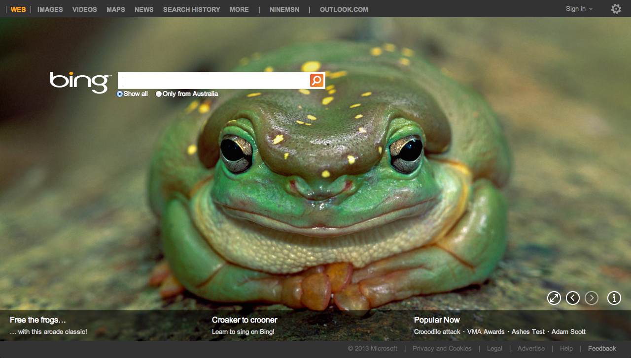
bing.com
Bing also uses a
simple layout which is similar to Google. Bing implemented changing background automatically
on its home page as part of getting more users attractive to it; however Google
still have more users who have found Google more attractive.
3.B. Examine at least two other similar or competing web sites. How similar are the labelling systems? Is any one site clearly the winner (and if so, why).
Ask.com
Ask.com has different concept to Google and Bing. Ask is a question answering-focused web search engine. Ask has nice and simple interface to use, however the heading does not clearly shows property.


Yea, I agree with you, to keep the home page simple is a golden key, it does give the user a good impression and also newbies would felt less confused for navigation
ReplyDelete